Understanding components
Each block of content on the website starts off as a component. These components are used as building blocks to create engaging pages.
We have a range of components that have been designed to present allies us to present different types of content, such as text, statistics, quotes, images, videos, and more.
Component list
Here's a comprehensive list of the components that can be used on the website, and when you might use them.
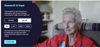
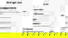
Page header component
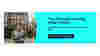
Used to display the page title and a short introduction to the page, along with a header image. The page header should always use the 'H1' heading style.
Text component
Allows content editor to display and format text. Includes options to manage headings styles, add bullet points, links, and buttons.
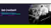
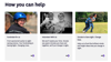
Text and image component
Allows content editor to display text and image together. There is the option to show the image to the left or to the right of the text. Includes options to manage headings styles, add bullet points, links, and buttons.
Single stats component
Allows you to display a single statistic or key information in a way that will stand out on the page. Includes a selection of icons to help illustrate and categorise the statistic.
Multiple stats component
Allows you to display a series of statistics in a way that will stand out on the page. Includes a selection of icons to help illustrate and categorise the statistic.
Media component
Displays a selected image, video, or Audio.
Promo component
Used to promote a call to action, linking to an internal or external page.
Quote component
The quote component is used to showcase a short extract from an individual or content piece. It can also include an image, and information such as the authors name and title, and a CTA button.
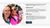
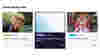
Content cards component
Displays a list of cards, each referencing a piece of content (either a page, or a dedicated piece of "Card" content).
Article cards component
Works in a similar way to content cards, displaying a list of articles.
Accordion component
Displays heading text with expandable elements that reveal hidden text. Can be used to display FAQs, for example.
Links list
This is a way of displaying links to other pages (either on or off site). It works in a similar way to the content cards, but does not display images, only text.
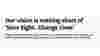
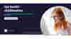
Hero component
Used on the homepage and specific campaign landing pages to prominently feature a heading, key message and call to action. Use of this component to be approved by comms team.
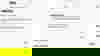
Donate widget
This component allows you to include a donation shopping list, explaining what could be achieved with different donation amounts. It also allows the user to select whether they would prefer to make a monthly or one-off donation.
When the donor selects a value and clicks on the CTA button, the information they have selected will be pulled through to the third party donate form, where they can complete their transaction.